Set Up Your Form Content
The Widget page is now part of one Widget & Form page. This guide covers the Content tab - where you set how the button behaves and what the withdrawal form asks customers. For colors and styling, see Customize the Form's Appearance.
Prerequisites
- The Avada Withdrawal Form app must be installed on your store.
- The Avada Withdrawal app embed should be active so the form and button can show. See Add the Withdrawal Form to Your Storefront.
Step 1: Open the Widget & Form Page
Open Avada Withdrawal Form and go to the Widget & Form page. Select the Content tab.
Step 2: Choose the Button Behaviour
In the Button behaviour card at the top, decide what happens when a customer clicks the widget button.
| Option | What it does |
|---|---|
| Open new page | Customers go to the full withdrawal form page |
| Popup | The withdrawal form opens in a popup on the current page |
The Preview panel updates to match your choice - a full page or a popup.
Step 3: Set the Button Text
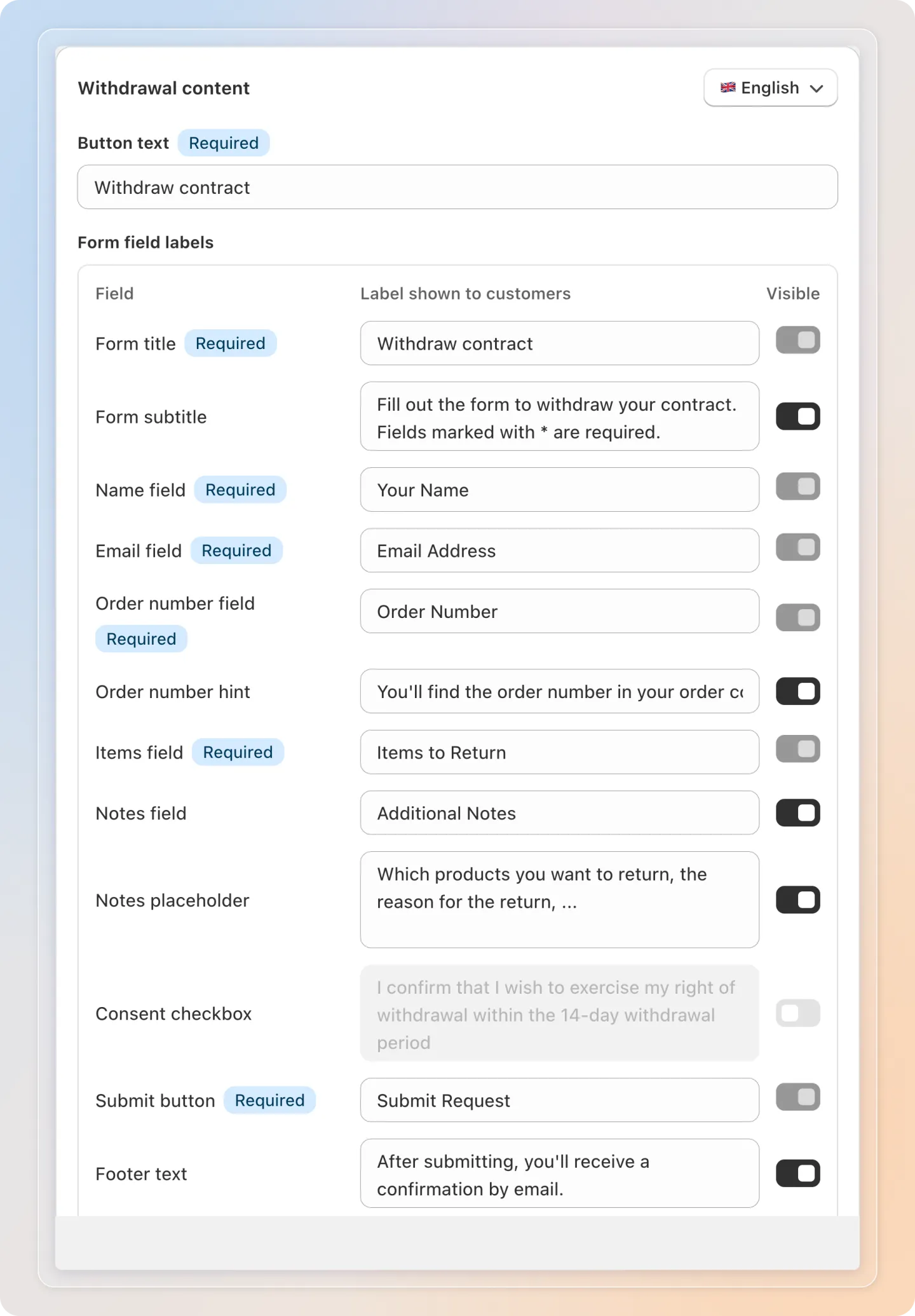
In the Withdrawal content card, set the Button text shown on the widget.
- Enter your own text, or leave it empty to auto-translate by storefront language.
Step 4: Edit Form Field Labels
Still in the Withdrawal content card, the Form field labels table lets you set the text customers see on the form. Each row shows the field, the label shown to customers, and whether the field can be hidden.
| Field | Default label shown to customers | Visibility |
|---|---|---|
| Form title | Withdraw contract | Always shown (required) |
| Form subtitle | Fill out the form to withdraw your contract. Fields marked with * are required. | Can be hidden |
| Name | Your Name | Always shown (required) |
| Email Address | Always shown (required) | |
| Order number | Order Number | Always shown (required) |
| Order number hint | You'll find the order number in your order confirmation. | Can be hidden |
| Items | Items to Return | Always shown (required) |
| Notes | Additional Notes | Can be hidden |
| Consent checkbox | I confirm that I wish to exercise my right of withdrawal within the 14-day withdrawal period | Off by default; see Step 6 |
| Submit button | Submit Request | Always shown (required) |
| Footer text | After submitting, you'll receive a confirmation by email. | Can be hidden |
Enter your own label in any row, or leave it empty to use the default. The Consent checkbox row comes with a ready-made default wording, so you can turn it on as-is or replace it with your own text.
Step 5: Set Field Visibility
Use the Visible toggle in the Form field labels table to choose which optional fields appear on the form. Four fields can be hidden:
- Form subtitle - the short instruction line below the title
- Order number hint - the helper text that tells customers where to find their order number
- Notes (Additional Notes) - lets customers add extra details
- Footer text - the confirmation note shown at the bottom of the form
Turn a field off for a shorter form, or on to give customers more guidance.
The required fields - Form title, Name, Email, Order number, Items, and the Submit button - are always shown and cannot be hidden.
Note: You don't need to set up the list of returnable items. After a customer enters a valid order number and matching email, the form automatically shows an Items to Return section listing the products in that order, so the customer can choose which items and quantities to withdraw. This section appears on its own - there is nothing to configure here.
Step 6: Require Confirmation Before Submitting
Turn on the Consent checkbox row in the Form field labels table to add a confirmation checkbox customers must tick before they can submit the form.
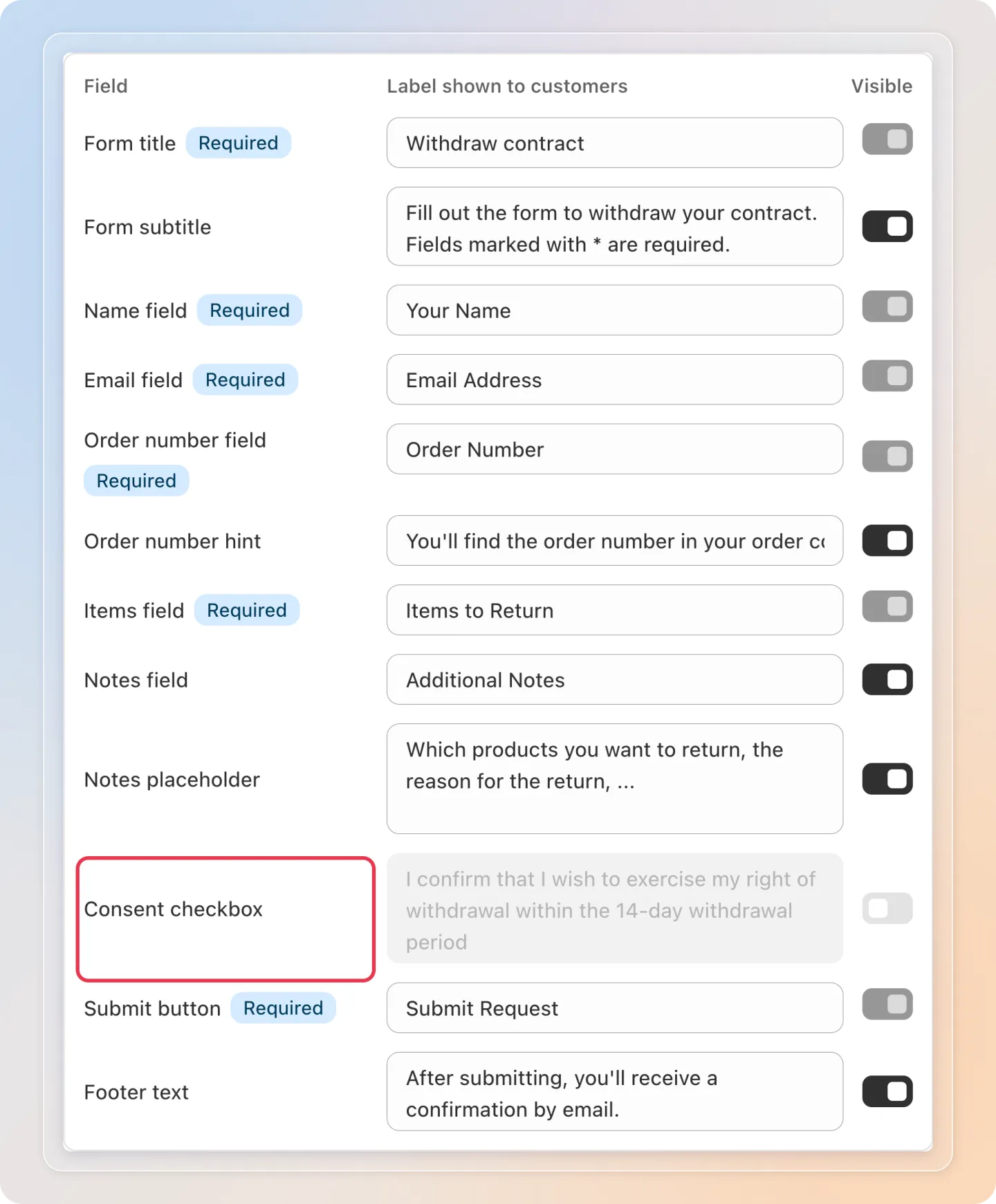
- Off by default. Once you turn it on, the checkbox is always required - there's no separate toggle to make it optional.
- The checkbox appears just above the Submit button, on both the full withdrawal form page and the popup widget.
- The Submit button stays greyed out until the customer ticks the box, then becomes clickable right away.
- If a customer ticks the box and unticks it again, a short reminder - "Please confirm before submitting." - appears under the checkbox. The reminder doesn't show when the customer first opens the form.
Note: The checkbox itself doesn't change color in any state - only the Submit button's enabled or disabled look changes.
Step 7: Translate per Language
Use the language switcher at the top of the Withdrawal content card to set the button text and field labels for each storefront language. Seven languages are supported: English, Deutsch, Français, Español, Italiano, Nederlands, and 日本語 (Japanese).
- Select a language, then enter labels for it
- Leave a field empty to use the auto-translated default for that language
Tip: Custom text you enter is used as-is for that language; empty fields fall back to the default translation.
Step 8: Save Your Content
- Click Save to apply your changes
- Use the Preview panel to confirm the form looks right before you leave
Tips
- Keep field labels short and clear so customers fill the form quickly.
- Use Popup behaviour to keep customers on the page they're browsing.
- Set labels for every language your store sells in to give all customers a clear form.
Related Articles
- Customize the Form's Appearance
- Add the Withdrawal Form to Your Storefront
- Manage Withdrawal Requests
And there you have it! You've set up your withdrawal form's behaviour and content. Customers now see the right fields and labels in their language. If you have any questions or run into any issues, don't hesitate to reach out. We're here to help!