Tag products on a photo so shoppers can buy the whole look
A Shop the look widget turns one photo into a shoppable gallery with a hotspot on each product.
You place the dots, called hotspots, on the products in the photo. Shoppers hover or tap a dot to see the product. They add one item or the whole look to their cart.
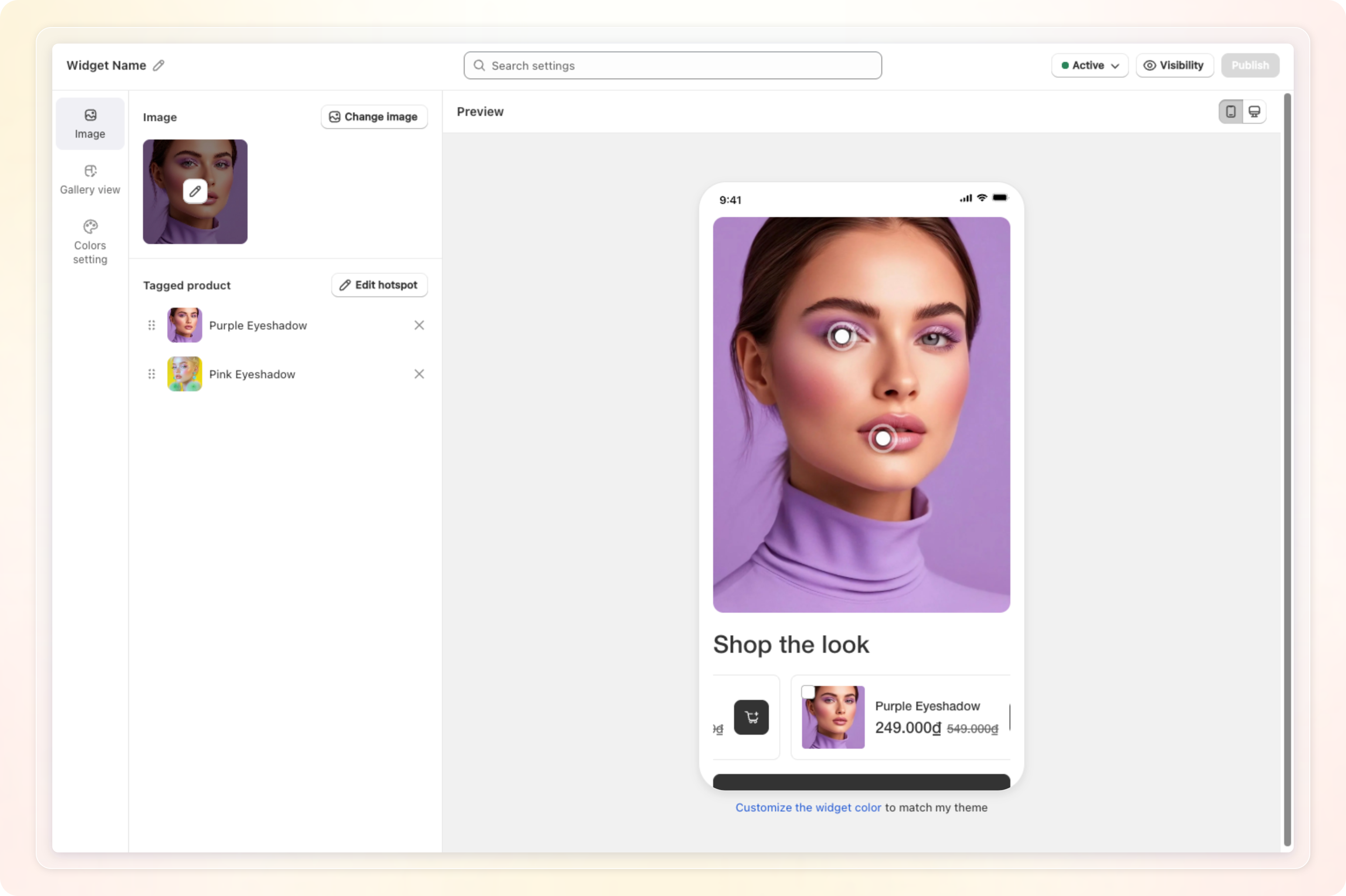
Shop the look is available on the Pro plan. On the Free plan the card shows a Pro badge and an Unlock button that opens the upgrade flow. If your store drops from Pro to Free, Shopvid sets your Shop the look widgets to Inactive.
Before you start
- Prepare one photo as a
.jpgor.pngfile of 5 MB or less. You can also pick an image already in your Shopify library. - Make sure every product you want to tag is active on your online store. Shoppers don't see hotspots for hidden or deleted products.
- Shop the look widgets appear on all pages except product pages. You don't choose a display page for this widget type.
Create a Shop the look widget
- In Shopvid, go to Manage widget. Click Add new widget.
- Under Select widget type, click Select widget on the Shop the look card.
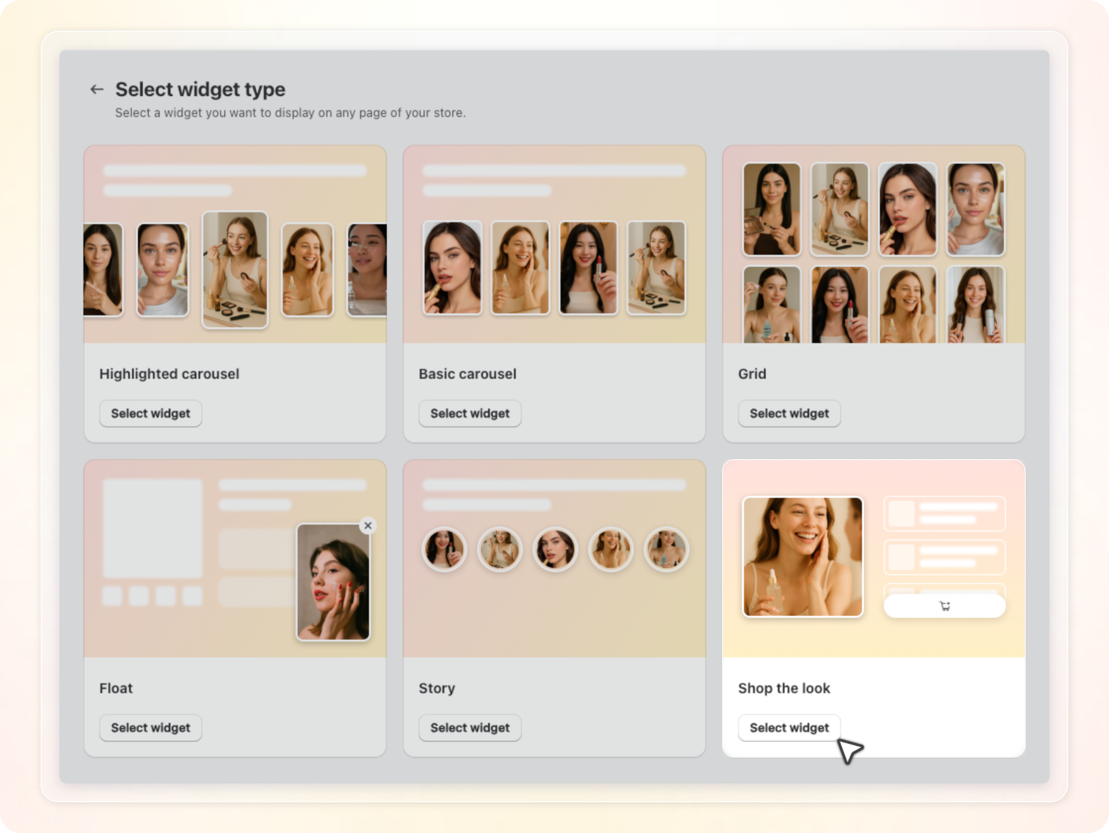
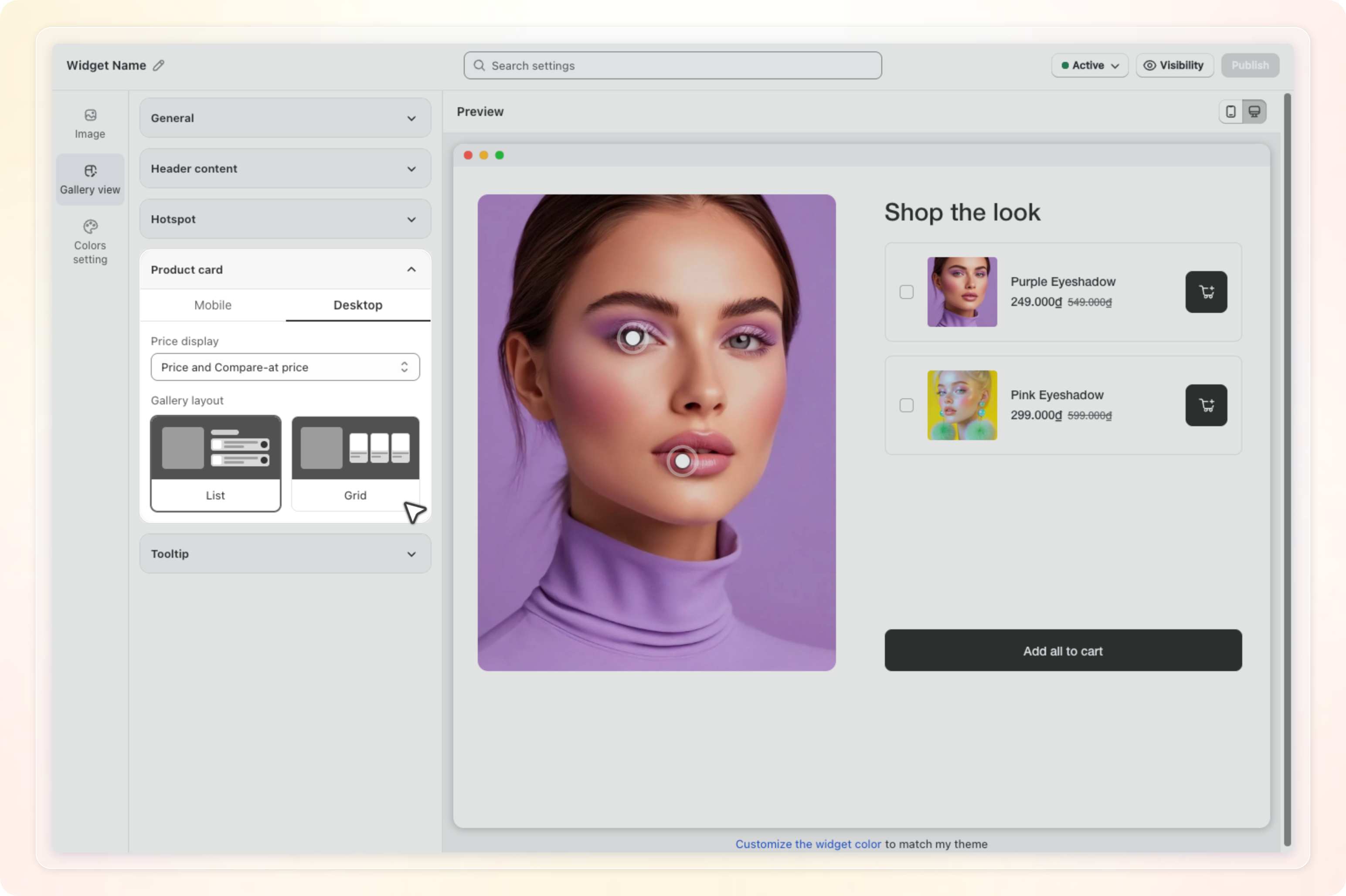
The widget editor opens with three tabs on the left: Image, Gallery view, and Colors setting. The preview on the right updates as you work. Use the phone and desktop icons above the preview to switch devices.
Add the look image
- On the Image tab, click Select image.
- In the Select image window, click Upload image to pick a file from your computer. Or tick an image under Or select from Shopify library. Then click Continue.
- In the Crop image window, choose a Ratio of 1:1, 4:3, or 3:4. Drag the frame over the part of the photo you want to show.
- Click Continue.
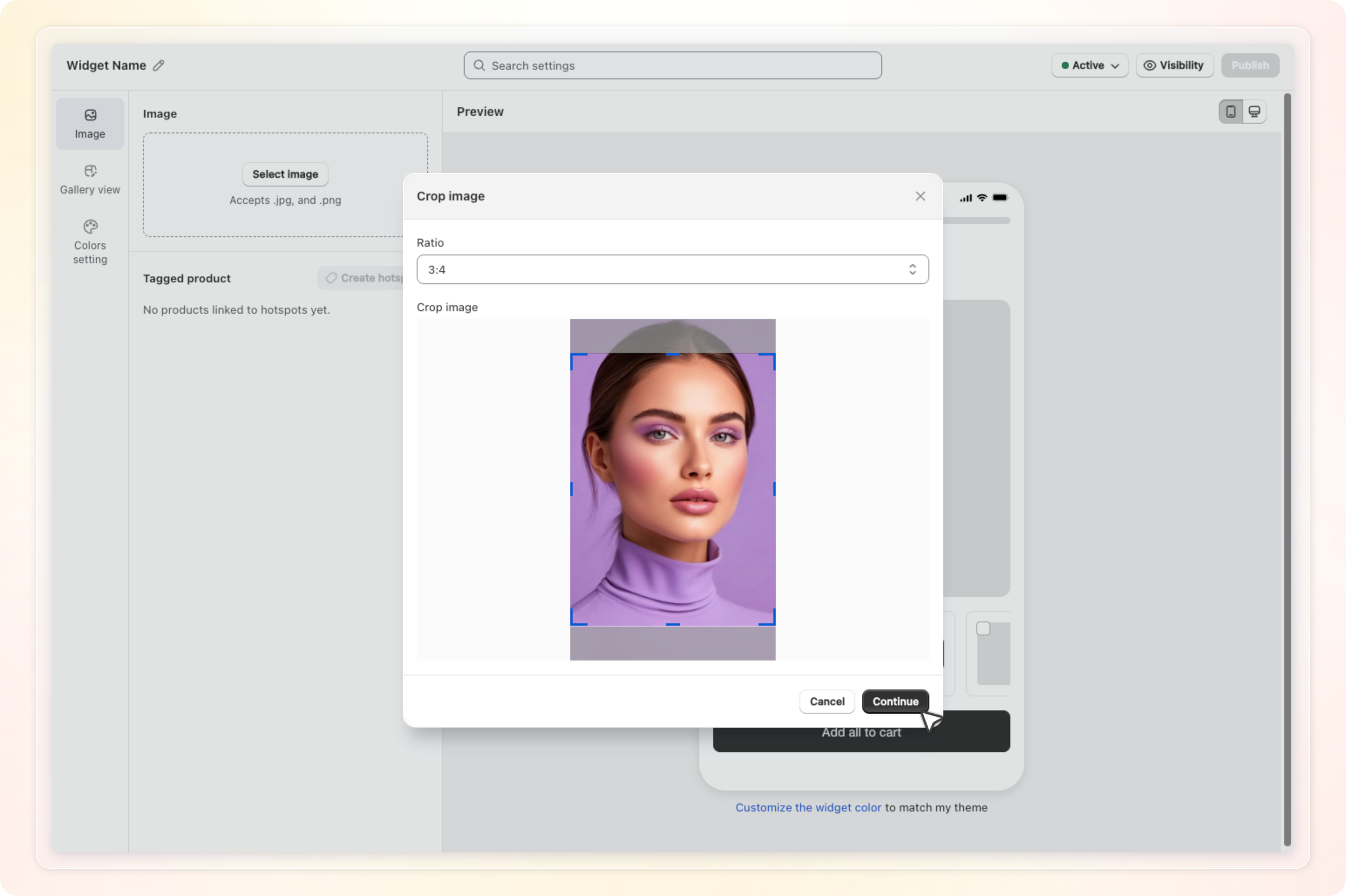
Shopvid uploads the cropped image and opens the Create hotspots window right away. Later, click the pencil on the thumbnail to open Re-crop image. Click Change image to start over with a new photo.
Changing or re-cropping the image removes every hotspot and tagged product on it. Shopvid asks you to confirm before it does this.
Tag products with hotspots
- In the Create hotspots window, click the spot on the photo where a product appears. A white dot appears with a Search products box next to it.
- Type to find the product, then click it in the list. The dot is now tagged.
- Repeat for each product in the photo, up to 6 hotspots. Once you reach 6, clicking the photo adds nothing more.
- Drag a dot to move it. Click Done when you are finished.
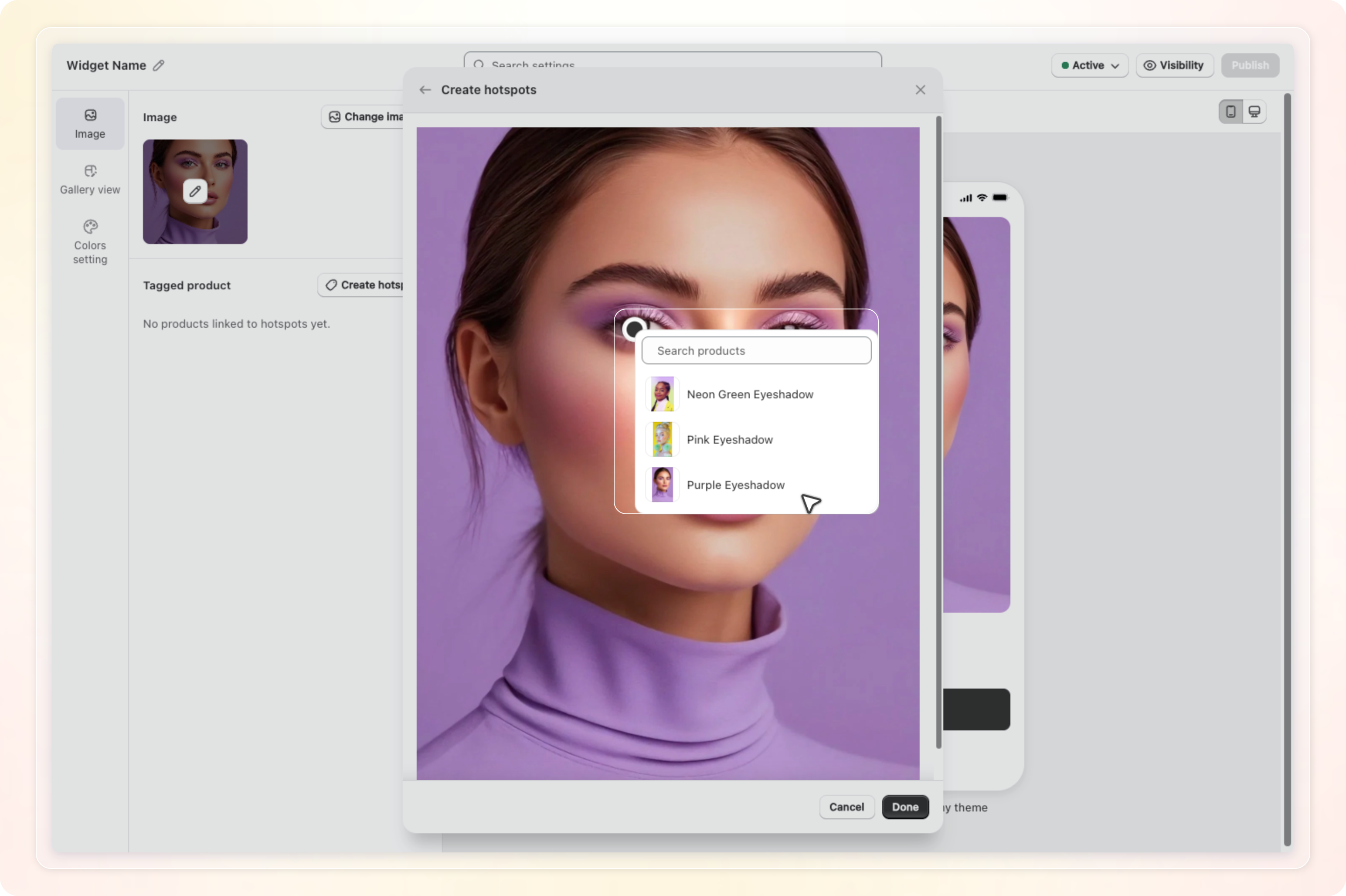
You can tag each product once per widget. Products you already tagged appear greyed out in the list. To point a dot at a different product, remove that product under Tagged product and place a new dot.
Reorder or remove tagged products
Under Tagged product on the Image tab, Shopvid lists every tagged product in the order shoppers see the cards.
- Drag the handle on the left of a product to change its place in the list.
- Click the X on the right to remove a product and its hotspot.
- Click Edit hotspot to reopen the window and move dots or add more.
If a tagged product is no longer available on your online store, the Edit hotspot window shows a banner. It tells you how many products are affected. The product gets an Unavailable chip. Its dot stays hidden on the storefront until you remove or replace the product.
Style the gallery
Open the Gallery view tab. Each group expands when you click it.
| Group | Settings |
|---|---|
| General | Font for all text in the widget, and Border radius for the image and cards. |
| Header content | Title of up to 100 characters. The default is Shop the look. Description (Optional) of up to 120 characters. |
| Hotspot | Hotspot type. Basic shows a plain dot. Number shows the product's position in the list. |
| Product card | Separate Mobile and Desktop tabs. Price display shows Price only or Price and Compare-at price. On Desktop you also pick a Gallery layout of List or Grid. On mobile the cards always scroll as a carousel. |
| Tooltip | Tooltip layout of Vertical or Horizontal. The tooltip appears on desktop only. |
Set the colors
Open the Colors setting tab.
- Click Sync theme under Auto match theme to pull colors from your store theme. Click it again to try another scheme.
- Color setting mode starts in Basic. Set Primary color, which fills the hotspots and buttons, and Button text & icon color.
- Click Basic to switch to Advanced. You then get Widget background color and Title & description color under General. Product card adds colors for the card background, product name, price, and compare at price. Tooltip adds colors for the tooltip background and product name.
Publish the widget
- Click the pencil next to Widget Name and name the widget.
- Click Save in the bar at the top of the editor. Publish stays disabled until the widget is saved once.
- Click Publish. Add the widget to your theme the same way as other Shopvid widgets. See Publish a widget.
An Active widget needs an image and at least one tagged hotspot before it can be saved. If either is missing, an error message appears on the Image tab.
What shoppers see
- On desktop, a shopper hovers a dot to open a tooltip with the product image, name, and price. Clicking the dot opens the tooltip too. Clicking it again scrolls to that product's card.
- On mobile, tapping a dot scrolls the carousel to the product's card. There is no tooltip.
- Each card has its own cart button. Shoppers can also tick several cards and click Add {n} products.
- Add all to cart adds every product in the look at once. Shopvid skips sold out products and shows the shopper a short message about them.
Plan and limits
- One widget holds up to 6 hotspots, and each product appears once.
- The look image must be a
.jpgor.pngof 5 MB or less. - The feature needs the Pro plan. On a downgrade, Shopvid sets your Shop the look widgets to inactive. Upgrade again and set them back to Active to show them.
Tips
- Pick a photo where every tagged product is clearly visible. Shoppers click the dot, so the dot should sit on the product itself.
- Use the Number hotspot type when products sit close together. The numbers match the order of the cards.
- Tag the hero product first. The first product in the list is the first card shoppers see on mobile.